ScanPayGo (SPG) is Waitrose & Partners’ in-store self-scanning experience across mobile and dedicated Zebra handsets, designed to modernise the shopping journey and replace the legacy Quick Check platform.
Company
Waitrose & Partners
Timeline
2024 -
Present
Role
Senior Product Designer responsible for end-to-end UX/UI design across the SPG mobile app and next-generation Zebra handset experience.
Project overview
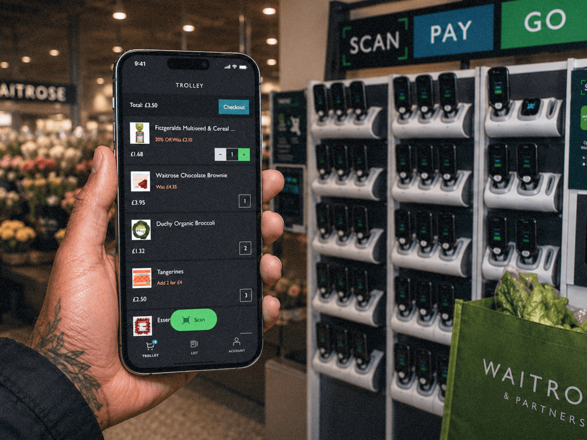
ScanPayGo (SPG) is Waitrose & Partners’ in-store self-scanning experience across mobile and dedicated Zebra handsets, designed to modernise the shopping journey and replace the legacy Quick Check platform.
I contributed across multiple phases of the programme, from the initial SPG mobile app launch through to the later redesign of the next-generation Zebra handset experience. My role focused on end-to-end product design across onboarding, scanning flows, loyalty integration, accessibility, interaction design, and future retail concepts.
Alongside designing the customer experience, I worked closely with research, engineering, and retail stakeholders to improve usability within real store environments, helping shape a more scalable and intuitive in-store ecosystem across 300+ branches.
Challenges
The biggest challenge was balancing modern consumer expectations with the operational complexity of a large-scale retail environment.
The existing experience felt outdated, fragmented, and heavily reliant on operational logic rather than customer behaviour. Research revealed that customers often ignored instructional messaging entirely, relying instead on instinctive physical interactions when collecting and using devices. This created friction around onboarding, loyalty interactions, handset unlocking, and scanning behaviour.
The platform also needed to support a wide demographic of users with varying levels of digital confidence, while accommodating accessibility needs, retail hardware limitations, fraud prevention requirements, and partner operational workflows.
As one of the lead designers involved across the programme evolution, I helped simplify complex retail interactions into clearer, lower-friction journeys while aligning both mobile and handset experiences into a more cohesive ecosystem.
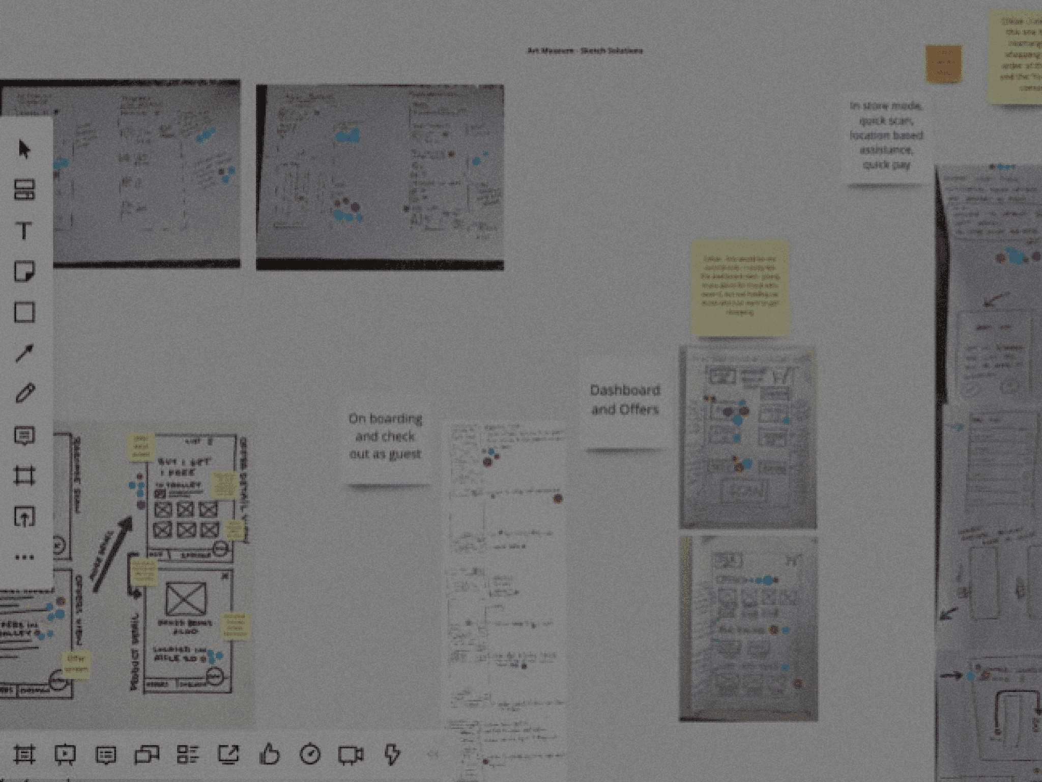
The initial SPG experience began as part of a collaborative design sprint focused on rethinking the outdated Quick Check journey. Through rapid sketching, journey mapping, and ideation sessions, we explored how a modern in-store scanning experience could feel more intuitive, accessible, and engaging for customers.
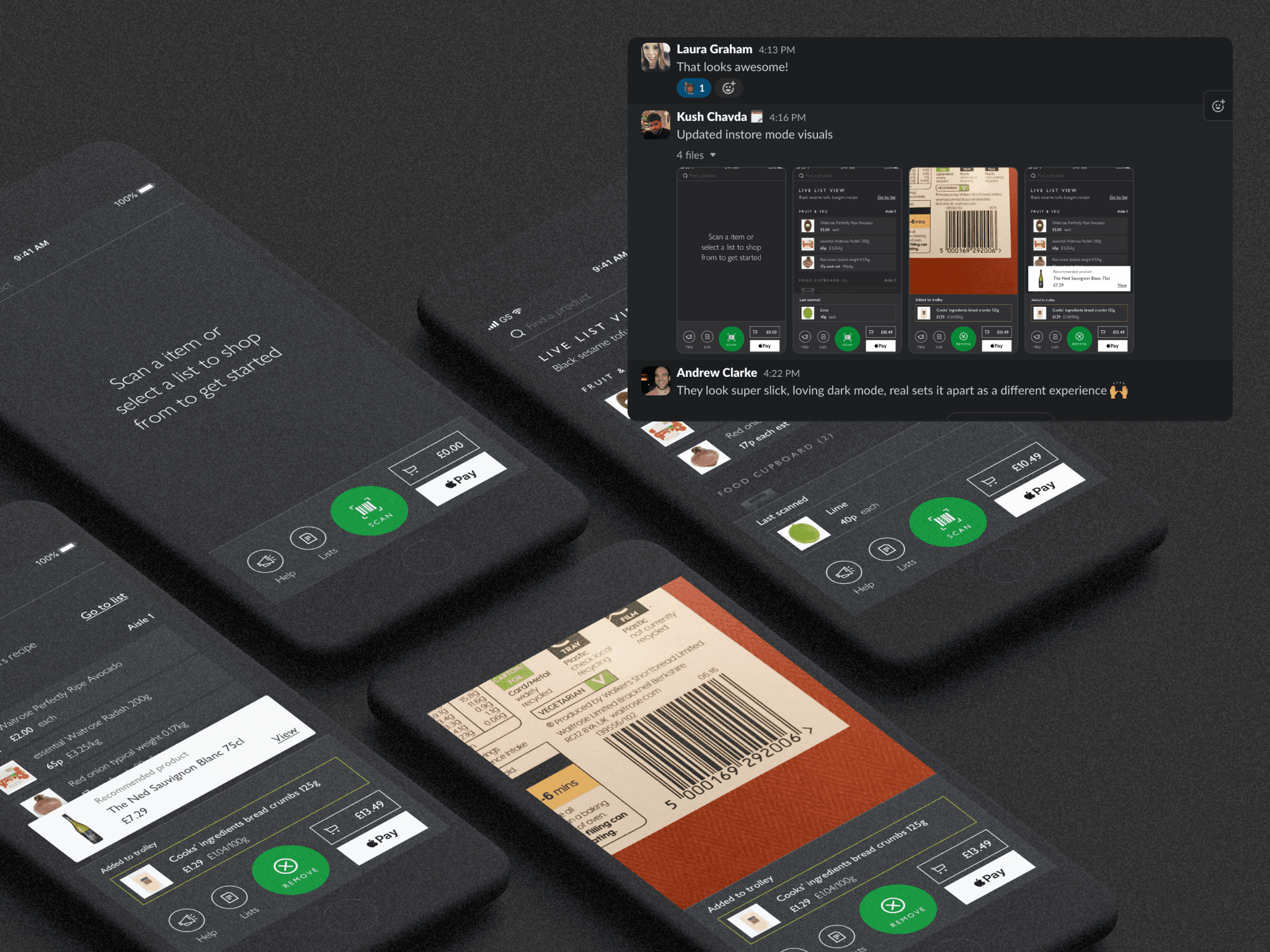
Following the sprint, early concepts were quickly translated into interactive prototypes which were remotely tested with users. These initial explorations helped shape the foundations of SPG, influencing onboarding, scanning interactions, visual direction, and the future retail experience that would later roll out across Waitrose stores nationwide.
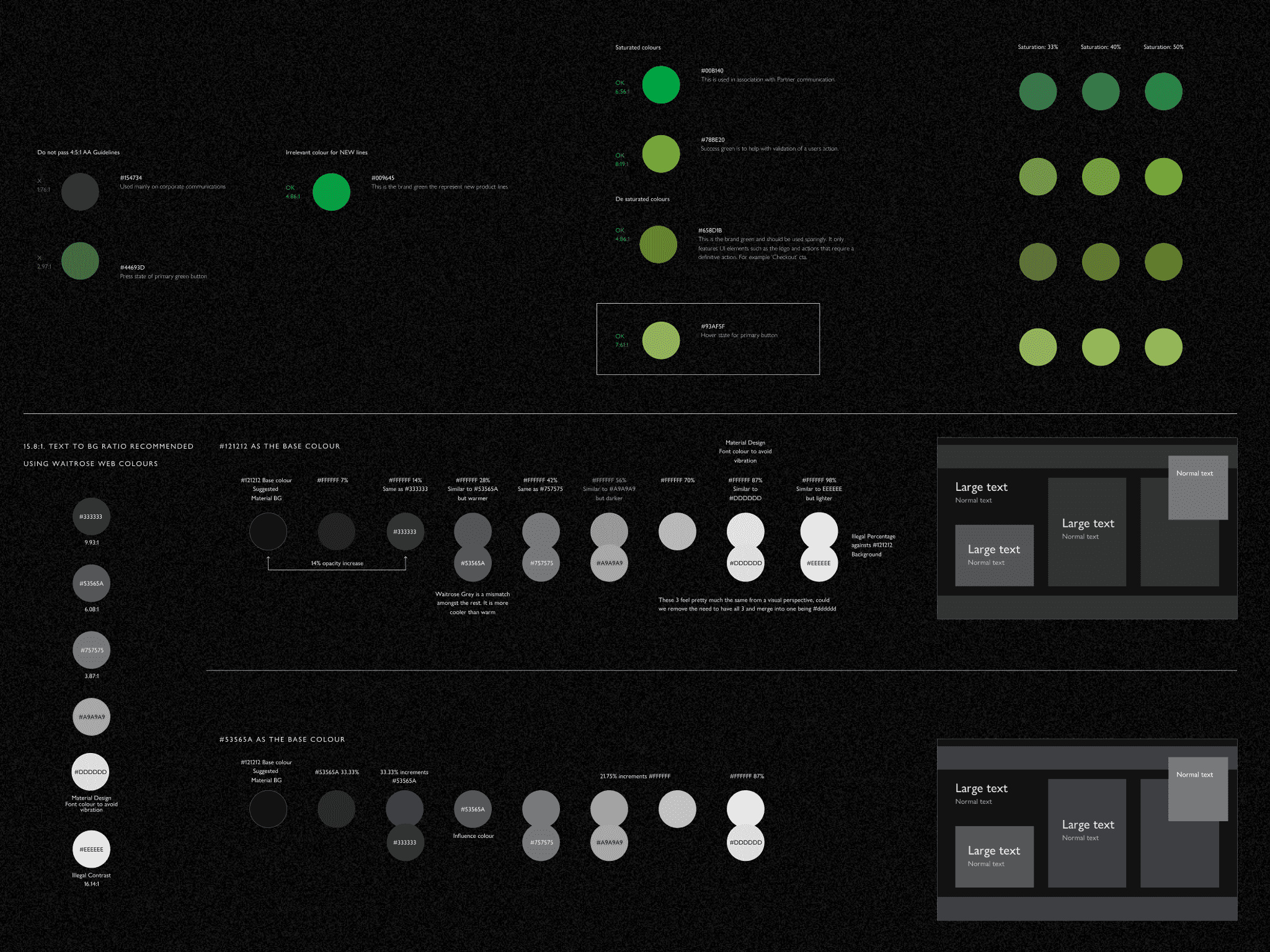
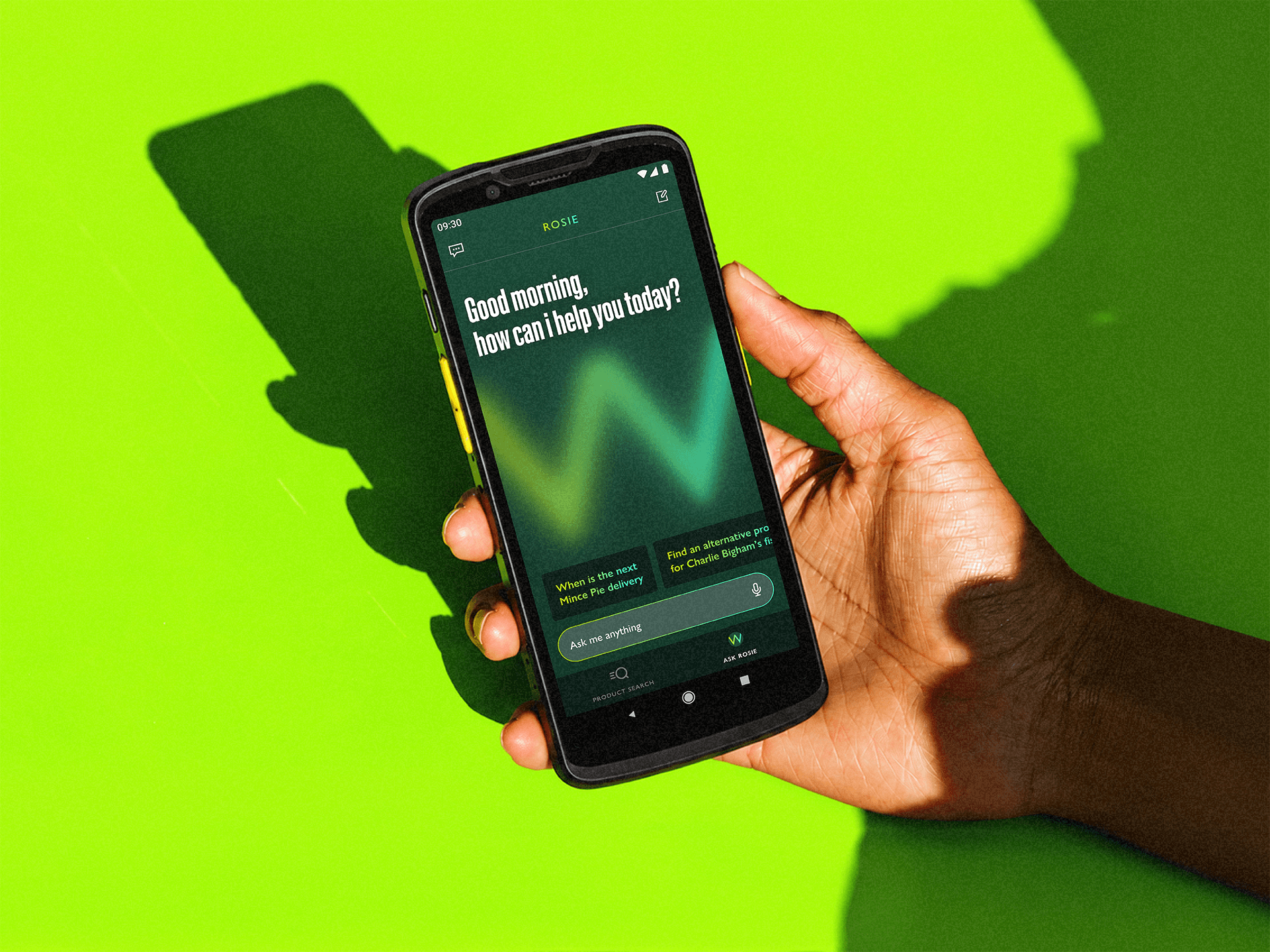
I proposed exploring a darker UI direction to help SPG feel more premium, modern, and distinct from the wider Waitrose digital ecosystem. I also explored accessible colour systems inspired by the Waitrose brand, helping define the visual direction for future SPG mobile and handset experiences.
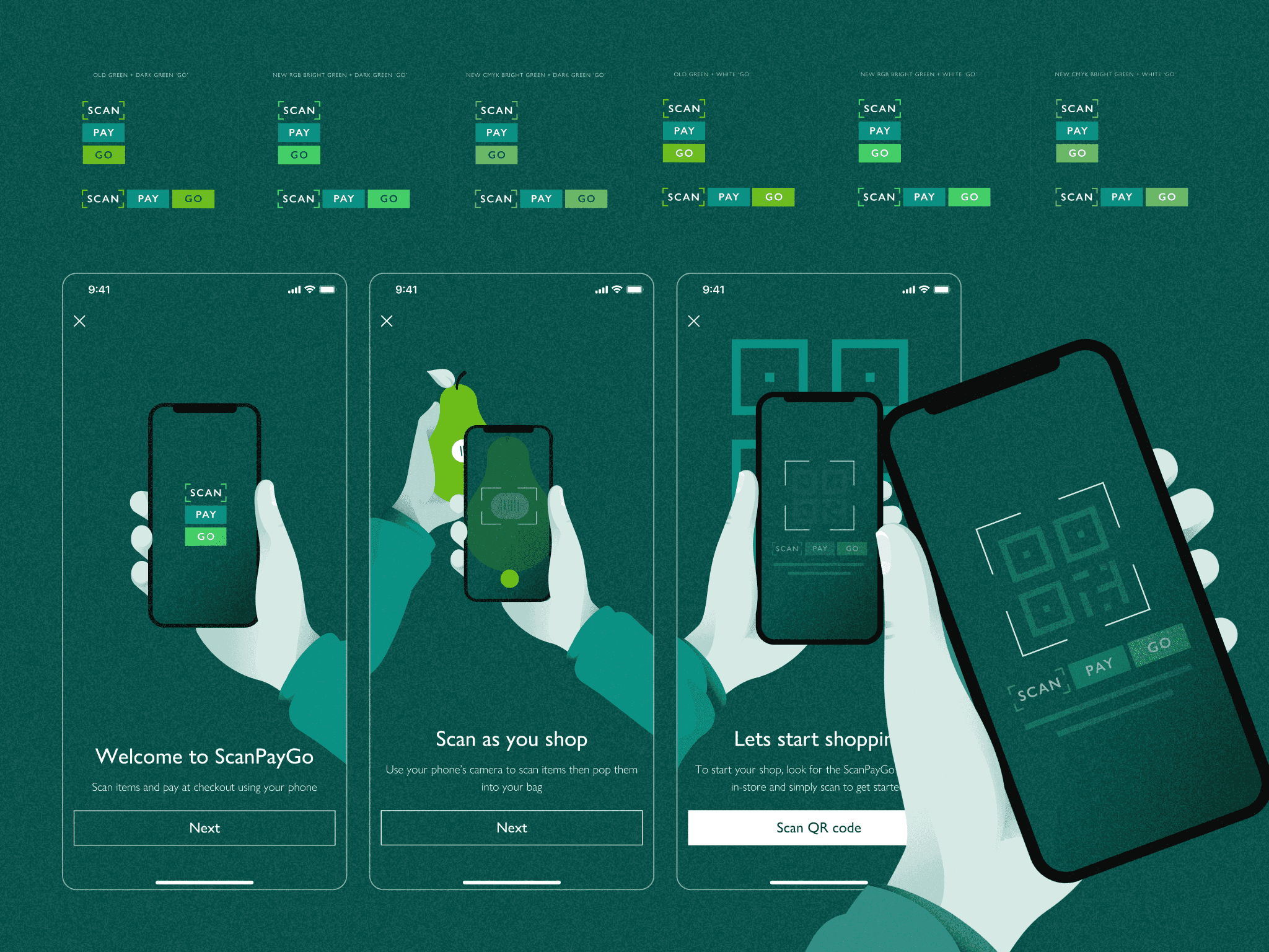
Alongside the early UX/UI direction, I was responsible for bridging the gap between product design and brand while the wider SPG identity was being developed by Pentagram. After early brand explorations relied heavily on existing Waitrose colours, I challenged and refined the palette to better support accessibility, usability, and digital experiences across mobile and in-store hardware. I also contributed towards the illustration styling and onboarding visuals used throughout the app and wider retail experience.
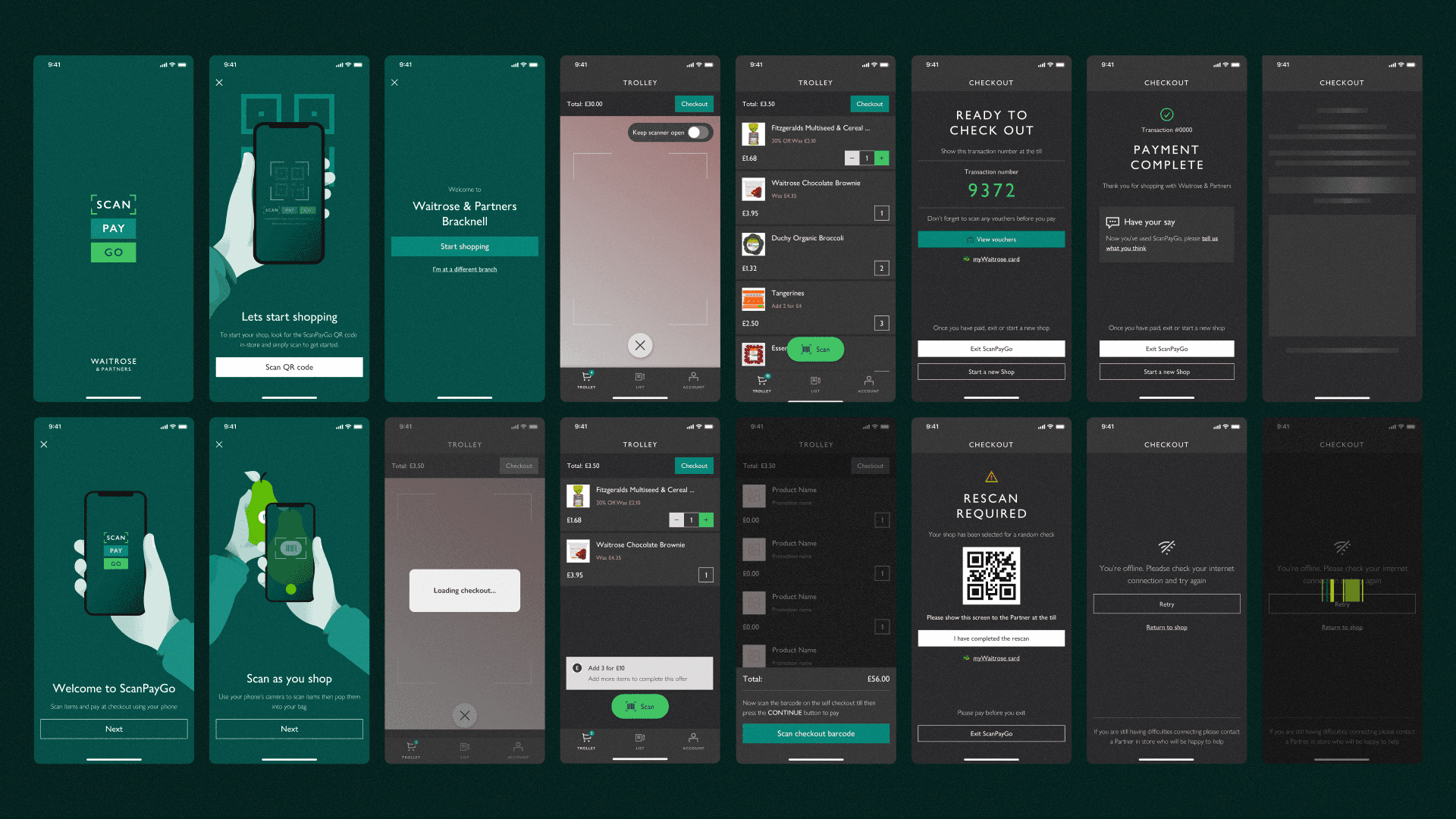
Early MVP journeys for onboarding, scanning, checkout, rescans, and in-store error handling across the first SPG mobile experience.
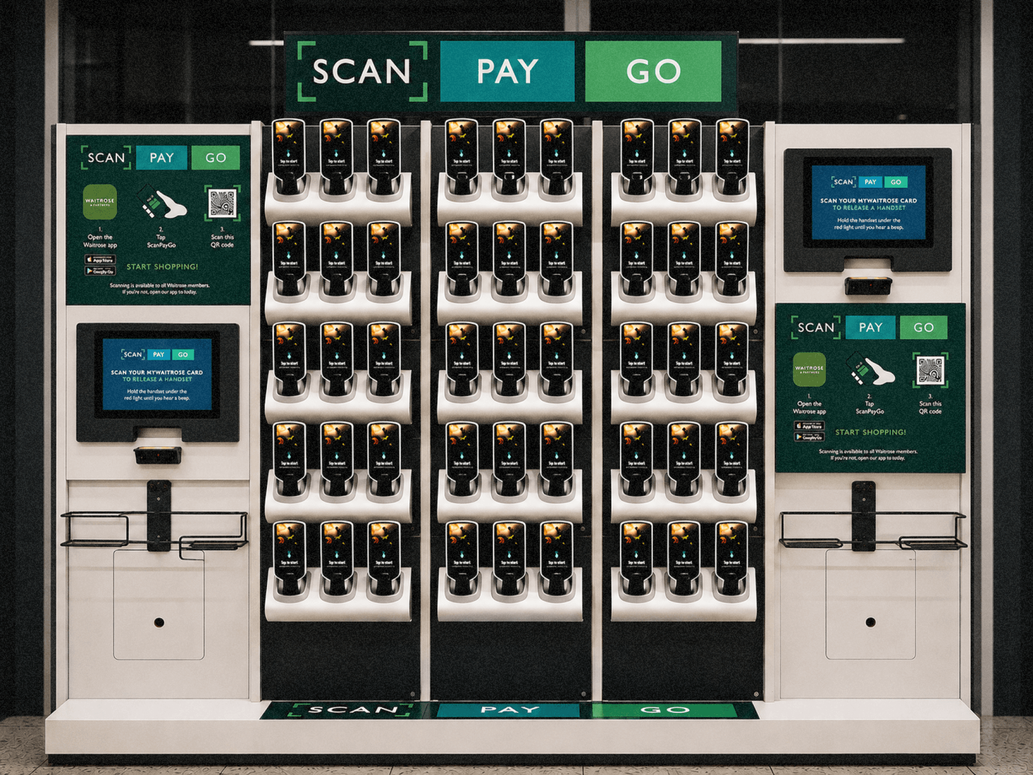
As part of the next-generation Zebra handset experience, we explored how the dock and unlock journey could become both more intuitive for customers and a stronger retail media opportunity for the business. Research showed many users instinctively attempted to remove devices before understanding the unlock flow, so I created a series of animated onboarding concepts designed to improve clarity, reinforce the new “Tap to Unlock” interaction, and create a more engaging first-touch experience. I designed and animated the visuals from scratch using the evolving SPG colour system, while also exploring how promotional content and seasonal campaigns could live naturally within the handset ecosystem similar to wider retail media experiences seen across competitors.

Research revealed confusion around how customers should use their MyWaitrose card during onboarding. To help simplify the interaction, I designed and animated a clearer unlock journey using custom illustrations, motion, and visual guidance informed directly by UX research and customer behaviour.
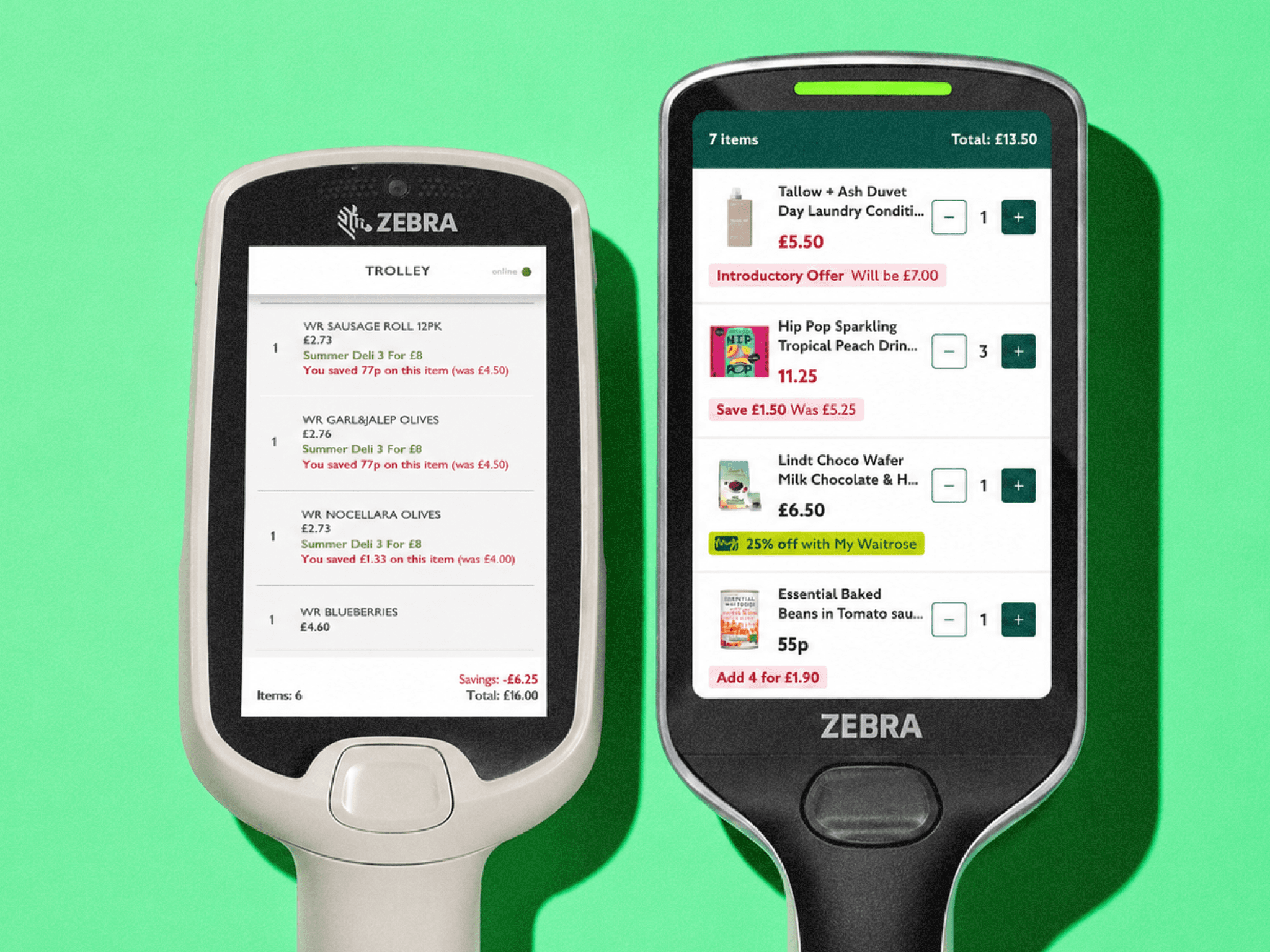
The original handset experience became dated and difficult to navigate. The redesign focused on improving readability, accessibility, promotional visibility, and overall consistency with the wider SPG experience.
Results
SPG launched across 318 Waitrose branches and became one of the business’ largest in-store digital transformation programmes.
The mobile rollout generated over 54,000 completed shops during pilot phases, with an 11% increase in average daily mobile usage compared to the previous Quick Check experience.
Customer research and iterative testing directly informed improvements to onboarding, unlock flows, scanning interactions, and accessibility guidance, helping reduce friction across the in-store journey and better align the experience with real customer behaviour.
Beyond immediate UX improvements, the work also helped establish a stronger long-term foundation for future retail innovation, including personalised experiences, pay-on-device journeys, improved loyalty integration, and greater parity between mobile and hardware platforms.
What the team said
“Kush contributed thoughtfully and provided great insight into user needs and expectations. He was approachable, helpful, and always receptive to feedback.”
“I’m so grateful for the work Kush contributed to the SPG app. It not only looked amazing, but felt really intuitive for users and helped push the experience towards something genuinely market-leading.”
“It was an absolute pleasure working with Kush on SPG. He made a huge contribution to the project and brought great energy, collaboration, and UX thinking throughout.”
“Kush contributed thoughtfully and provided great insight into user needs and expectations. He was approachable, helpful, and always receptive to feedback.”
ScanPayGo (SPG) is Waitrose & Partners’ in-store self-scanning experience across mobile and dedicated Zebra handsets, designed to modernise the shopping journey and replace the legacy Quick Check platform.
Company
Waitrose & Partners
Timeline
2024 -
Present
Role
Senior Product Designer responsible for end-to-end UX/UI design across the SPG mobile app and next-generation Zebra handset experience.
Project overview
ScanPayGo (SPG) is Waitrose & Partners’ in-store self-scanning experience across mobile and dedicated Zebra handsets, designed to modernise the shopping journey and replace the legacy Quick Check platform.
I contributed across multiple phases of the programme, from the initial SPG mobile app launch through to the later redesign of the next-generation Zebra handset experience. My role focused on end-to-end product design across onboarding, scanning flows, loyalty integration, accessibility, interaction design, and future retail concepts.
Alongside designing the customer experience, I worked closely with research, engineering, and retail stakeholders to improve usability within real store environments, helping shape a more scalable and intuitive in-store ecosystem across 300+ branches.
Challenges
The biggest challenge was balancing modern consumer expectations with the operational complexity of a large-scale retail environment.
The existing experience felt outdated, fragmented, and heavily reliant on operational logic rather than customer behaviour. Research revealed that customers often ignored instructional messaging entirely, relying instead on instinctive physical interactions when collecting and using devices. This created friction around onboarding, loyalty interactions, handset unlocking, and scanning behaviour.
The platform also needed to support a wide demographic of users with varying levels of digital confidence, while accommodating accessibility needs, retail hardware limitations, fraud prevention requirements, and partner operational workflows.
As one of the lead designers involved across the programme evolution, I helped simplify complex retail interactions into clearer, lower-friction journeys while aligning both mobile and handset experiences into a more cohesive ecosystem.
The initial SPG experience began as part of a collaborative design sprint focused on rethinking the outdated Quick Check journey. Through rapid sketching, journey mapping, and ideation sessions, we explored how a modern in-store scanning experience could feel more intuitive, accessible, and engaging for customers.
Following the sprint, early concepts were quickly translated into interactive prototypes which were remotely tested with users. These initial explorations helped shape the foundations of SPG, influencing onboarding, scanning interactions, visual direction, and the future retail experience that would later roll out across Waitrose stores nationwide.
I proposed exploring a darker UI direction to help SPG feel more premium, modern, and distinct from the wider Waitrose digital ecosystem. I also explored accessible colour systems inspired by the Waitrose brand, helping define the visual direction for future SPG mobile and handset experiences.
Alongside the early UX/UI direction, I was responsible for bridging the gap between product design and brand while the wider SPG identity was being developed by Pentagram. After early brand explorations relied heavily on existing Waitrose colours, I challenged and refined the palette to better support accessibility, usability, and digital experiences across mobile and in-store hardware. I also contributed towards the illustration styling and onboarding visuals used throughout the app and wider retail experience.
Early MVP journeys for onboarding, scanning, checkout, rescans, and in-store error handling across the first SPG mobile experience.
As part of the next-generation Zebra handset experience, we explored how the dock and unlock journey could become both more intuitive for customers and a stronger retail media opportunity for the business. Research showed many users instinctively attempted to remove devices before understanding the unlock flow, so I created a series of animated onboarding concepts designed to improve clarity, reinforce the new “Tap to Unlock” interaction, and create a more engaging first-touch experience. I designed and animated the visuals from scratch using the evolving SPG colour system, while also exploring how promotional content and seasonal campaigns could live naturally within the handset ecosystem similar to wider retail media experiences seen across competitors.
Research revealed confusion around how customers should use their MyWaitrose card during onboarding. To help simplify the interaction, I designed and animated a clearer unlock journey using custom illustrations, motion, and visual guidance informed directly by UX research and customer behaviour.
The original handset experience became dated and difficult to navigate. The redesign focused on improving readability, accessibility, promotional visibility, and overall consistency with the wider SPG experience.
Results
SPG launched across 318 Waitrose branches and became one of the business’ largest in-store digital transformation programmes.
The mobile rollout generated over 54,000 completed shops during pilot phases, with an 11% increase in average daily mobile usage compared to the previous Quick Check experience.
Customer research and iterative testing directly informed improvements to onboarding, unlock flows, scanning interactions, and accessibility guidance, helping reduce friction across the in-store journey and better align the experience with real customer behaviour.
Beyond immediate UX improvements, the work also helped establish a stronger long-term foundation for future retail innovation, including personalised experiences, pay-on-device journeys, improved loyalty integration, and greater parity between mobile and hardware platforms.
What the team said
“Kush contributed thoughtfully and provided great insight into user needs and expectations. He was approachable, helpful, and always receptive to feedback.”
“I’m so grateful for the work Kush contributed to the SPG app. It not only looked amazing, but felt really intuitive for users and helped push the experience towards something genuinely market-leading.”
“It was an absolute pleasure working with Kush on SPG. He made a huge contribution to the project and brought great energy, collaboration, and UX thinking throughout.”
“Kush contributed thoughtfully and provided great insight into user needs and expectations. He was approachable, helpful, and always receptive to feedback.”